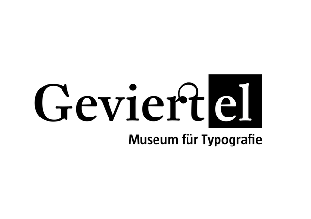
So there have been some small corrections to the logo. I had the guts to change Mr. Fleischmann's shapes (only for the logo). This is it:
|
So there have been some small corrections to the logo. I had the guts to change Mr. Fleischmann's shapes (only for the logo). This is it:
0 Comments
 Nach ca. 80 verschiedenen Varianten, Kopfweh und neuen Versuchen, mehr Kopfweh, Änderungen und Kritik, das ist das aktuellste Logo.
Die Schriftart ist DTL Fleischmann mit ein paar Korrekturen: - eigene rt Ligatur - schmäleres G - angepasste optische Höhe für die Serifen von v und i. Hallo, Typonarrische und Typounwissende!
Dieses Blog wird euch up-to-date mit dem aktuellsten Stand des Projektes »Geviertel« halten. Das Geviertel ist das erste Museum für Typografie. Hier wird schöne Typo verehrt. Die Freaks unter euch können viele schöne Sachen sehen und sich bestätigt fühlen, dass es auch andere Type-Lovers da sind. Für die, die immer noch Regenbogeneffekte in Worddokumente erstellen und die Öffnungszeiten des eigenen Geschäfts in Comic Sans setzen wird es eine Menge Exponate geben, die dafür sorgen, dass sich deren Einstellung zu Typografie ändert. Typogrüße, Diana Die meisten werden es nicht wissen oder nicht wahrnehmen, aber Typografie ist eine sehr wichtige Sache in underen Leben.
Most of us are not aware of it, but typography has a very important place in our lives. Everything form the STOP-sign to the tiny font in the footer of a contract has been thought out and design to communicate something in particular. Typography manipulates, as do pictures and movies. So learn something about it and stop using Comic Sans. |
 Archives
May 2011
Categories
All
|
 RSS Feed
